Logo concepts

Six directions for Aria.

Research-backed alternatives to the rejected sparkle and gem. Each combines the depth-shaded orb with a different distinguishing element.
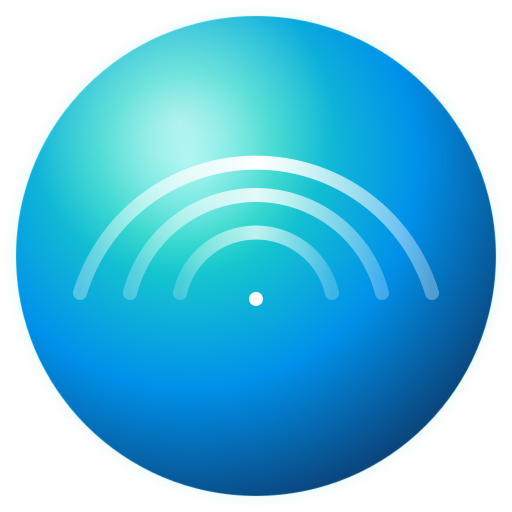
Concentric Arc Halo
160
96
32

Concentric Arc Halo

Research #1 — top distinctive bet

Why: 3 nested arc segments emanating from a focal point. Sonos-adjacent vocabulary (audio-credible) without copying it. Reads as voice radiating, ripples, song emanating. No AI voice brand owns this shape.

Risk: Could read static if not paired with the live ripple animation.

Lemniscate / Phase Curve
160
96
32

Lemniscate / Phase Curve

Research #2 — math-elegant, song-coded

Why: Closed continuous curve forming a figure-8 / infinity. Lissajous oscilloscope heritage means it reads literally as song/oscillation. Italian-operatic flourish. Underused in AI marks.

Risk: Infinity sign is overloaded — keep teal, not multicolor, to avoid Microsoft-Edge adjacency.

Mobius Ribbon
160
96
32

Mobius Ribbon

Research #3 — feminine + continuous

Why: Two-tone ribbon shape — front face lit, back face shaded — suggests 3D twist. Continuous flow = voice flow. Warm + feminine + tech without floral cliché.

Risk: Watch for swoosh/Microsoft-Edge adjacency. Centered, not directional, mitigates.

Sharp Geometric Rosette
160
96
32

Sharp Geometric Rosette

Research #4 — operatic/female-coded

Why: 6 sharp kite-shaped petals — straight tangents, acute tips. Distinct from ChatGPT's soft 6-petal blossom by being mathematically constructed. Reads as 'song-rosette.'

Risk: Closer to existing blossom language than the others — must execute the sharpness cleanly.

Voice Spiral
160
96
32

Voice Spiral

My pick — voice as breath/song

Why: Logarithmic spiral curving inward to a bright focal point. Voice swirling, breath rising. Distinctive shape vocabulary, ownable.

Risk: Spiral is hard to read at small sizes; could blur into a comma shape.

Iris Aperture — Chromatic Sweep
160
96
32

Iris Aperture — Chromatic Sweep

Iteration — Immich-inspired multi-color

Why: 6 blades, each in a different hue: 1 warm coral accent at top + 5 cool blades sweeping through teal → blue → deep blue → purple → mid-teal. Distinguishes hard from monochrome marks (the move that makes Immich's logo stand out), but anchored around Aria's brand teal/blue so it doesn't read as full rainbow.

Risk: Could read 'startup template' if the colors aren't tightly curated. Most distinctive of the three aperture variants.

Iris Aperture — Single Warm Accent
160
96
32

Iris Aperture — Single Warm Accent

Iteration — quieter color move

Why: 5 teal blades alternating lit/shaded + 1 coral accent at top (the 'voice point'). Distinctive color but stays close to the established teal/blue palette. The warm accent reads as 'feminine voice within the cool tech container.'

Risk: Less distinctive than the chromatic sweep — could read as a single 'wrong color' to some viewers.

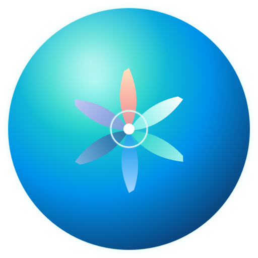
EPOCH 6+1 — Luminous Ring
160
96
32

EPOCH 6+1 — Luminous Ring

Governance: thin halo / aura

Why: Governance as a thin luminous ring around the center dot. Subtle, encircling, reads as 'constitutional halo above the operational layers.'

Risk: Subtle to the point of disappearing at 32px.

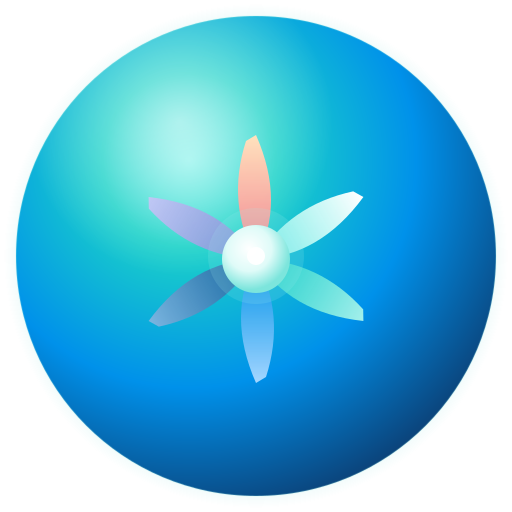
EPOCH 6+1 — Filled Disc
160
96
32

EPOCH 6+1 — Filled Disc

Governance: heart / core

Why: Governance as a solid filled inner disc with apex highlight. Bolder presence — 'the constitutional core at the heart of the platform.' Reads gem-like; the voice point sits luminously on top.

Risk: Disc is dominant; could compete with the blades for attention.

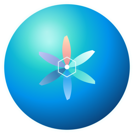
EPOCH 6+1 — Hexagonal Frame
160
96
32

EPOCH 6+1 — Hexagonal Frame

Governance: seal / institution

Why: Governance as a hexagonal frame — 6-sided geometry mirroring the 6 blades. Tech-coded, formal, institutional. Reads as 'constitutional seal' or 'platform structure.'

Risk: Hex is overused in crypto/SaaS marks. Risk of reading 'tech template.'

EPOCH 6+1 — Pure Halo
160
96
32

EPOCH 6+1 — Pure Halo

Governance: ambient light

Why: Governance as pure radial light — no hard edge anywhere. The constitutional core glows softly through the blade convergence. Ineffable, transcendent reading.

Risk: Without any defined element, can read as 'just a brighter center.' Less explicitly 7-element.

EPOCH 6+1 — Disc + Integration Threads
160
96
32

EPOCH 6+1 — Disc + Integration Threads

Governance + tight integration

Why: Filled disc base + 6 thin gradient-faded threads radiating from the governance core through each blade's center axis. Conceptually accurate: the 14 constitutional principles thread through every operational layer; governance isn't separate, it permeates. Threads fade outward — governance influence diminishes from core to edge.

Risk: Threads add visual density; risk of reading 'busy' at small sizes.

EPOCH 6+1 — Halo + Integration Threads
160
96
32

EPOCH 6+1 — Halo + Integration Threads

Governance + tight integration (lighter)

Why: Pure halo base + 6 thinner threads. Same integration concept as 02g but lighter touch — no hard governance disc, just ambient core glow with threads anchoring it to each blade. Reads more 'woven' and less 'central authority.'

Risk: Without a defined center disc, the threads have less of a clear origin to emanate from.

Research summary

The 4-point AI sparkle (Anthropic, Gemini, Notion, Copilot) is saturated to the point of being a brand-equity dead end. ChatGPT's 2025 redesign now owns the soft 6-petal blossom. Multi-color aurora blobs read as Siri rip-offs without a strongly differentiated inner mark. The faceted gem we tried reads as jewelry, not voice.

Sonos's 2025 brand refresh leans on concentric radiating lines — the most audio-credible vocabulary available. The agent ranked concentric arc halo as the safest distinctive bet for Aria: borrows audio credibility without copying, lands warm- tech, sidesteps every saturated shape.

Tell me which one (or which two to combine) and I'll polish the winner and wire it as aria-avatar.svg.